Lab 7 - Map Data Dashboards
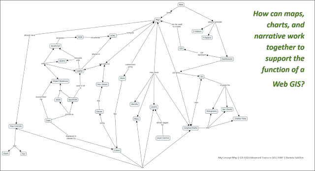
As the closing lab for this class, we were provided one last concept map "parking lot" and focus question: How can maps, charts, and narrative work together to support the function of a Web GIS? Here's my explanation of my concept map propositions and linking phrases, (as pictured below):
I used a lot of my propositions and linking phrases from our last concept map, but interestingly, I moved the majority of them to the left side of my concept map because I felt a strong need to tie the new terms to the word “map”. What has been nice about creating these concept maps is recognizing the importance of every module topic in class. It reminds me of what Stephen Few (2006) argues in his book when he states, “customers are expert in knowing what they need to accomplish, but not in knowing how software ought to be designed to support their needs” (p. 5). In order to build great dashboards and/or Web GIS, we have to think beyond the dazzle and glitter, because ultimately, it’s about communication (Few, 2006). As GIS practitioners and graduate students, I believe it is our responsibility to understand how Web GIS are designed at both a macro and micro level. By exercising our brains to create concept maps, I believe we are gaining a better perspective, but more importantly, reminding us of the complexities that we must harness to create better geo-visualization solutions.
And to put the icing on the cake, of course, we also combined all skills learned this summer to create a map-based digital dashboard by styling sections of a webpage using HTML and CSS, titled "Bayou Texar Water Quality by Daniela Sabillon, University of West Florida". Then I populated my page with a Leaflet map and a D3 bar chart. Screenshots of my work are provided below.


Comments
Post a Comment