Lab 6 - D3.js (Data-Driven Documents)
Developed by Bostock et al. (2011), D3 or Data-Drive Documents, provide us the opportunity to create dynamic, interactive data visualizations in web browsers. Couple that with mapping, and BAM--you got a powerful recipe for information absorption.
In this week's lab assignment, one of our main tasks included preparing data for a D3 bar chart, and then of course, creating it. Below is a screenshot of my bar chart running through my Apache localhost. The data preparation included transforming two provided datasets from shapefile to CSV format, and then adjusting the .html template by placing the nitrogen.csv file within my S:\htdocs folder. To accommodate the new dataset I just went through the code in Notepad++ and replaced the date format on line 32 as “%M/%d/%Y”, as well as for line 41 for the .tickFormat. Finally, I replaced line 55 to reference the nitrogen.csv file by replacing the previous text.
We were also tasked with locating two different publicly available Web GIS that combine both maps and graphs within their functionality. My two examples are provided below.
EXAMPLE 1
Brief description: “The application displays geographic economic data through maps, charts, and tables, allowing users to explore employment and wage data of private industry at the National, State, and County level” (U.S. Bureau of Labor Statistics, 2018).
How charts/graphs add functionality: It increases an understanding of the values represented spatially. When you hover over shades on the charts/graphs, it automatically emphasizes the associated administrative boundaries. Very neat feature, it really extends the ability to find meaning in attribute tables.
Technologies being used: The Sources and Network tabs within Chrome Developer Tools, led me to find out that JavaScript and jQuery (a JS Library) are being used, and of course, CSS.
EXAMPLE 2
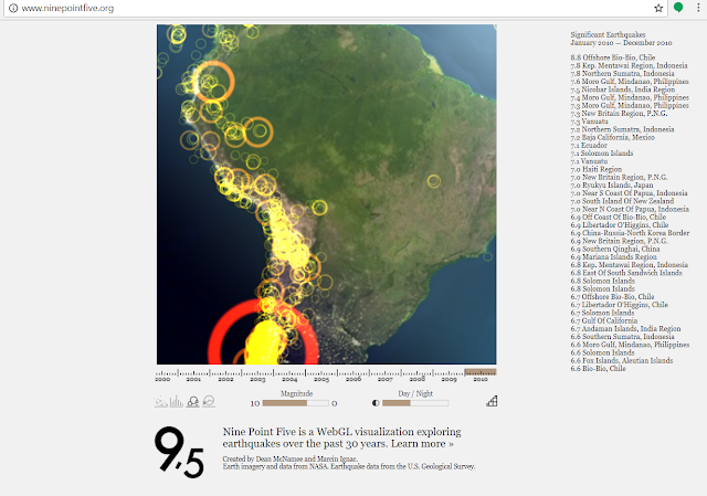
Title/URL: Nine Point Five
Brief description: This interactive map allows the user to view significant earthquakes over the past 30 years, while also being able to manipulate the views with various chart options.
How charts/graphs add functionality: The user is able to immerse himself/herself by toggling between the ‘Magnitude’ and ‘Day/Night’ interactive bar charts, choosing a ‘Year’ from a timeline, as well as sampling the data from a scatterplot, 3D vertical graph, or bubble chart perspective – within the map.
Technologies being used: The web page where this map is situated says that ii uses “WebGL” to visualize/explore the earthquakes. Within Chrome Developer tools, I noticed that JavaScript, jQuery (a JS Library), and CSS are being used, too.
These two other maps (links below) don’t have charts/graphs that I could find. But I thought they were so incredibly neat, that I had to share. Especially the live tracking of whales!


Comments
Post a Comment