Week 3 - GIS & Cartography
This week's lecture started out with a brief history lesson where we journey through some really cool GIS and cartographic historical milestones. More importantly, we learned about key contributors, such as:
- Claudius Ptolemy (best known for his book Geographica, published in 150 AD), whom was the first to introduce the use of latitude and longitude lines;
- Johannes Gootenberg, inventor of the printing press which allowed for mass production of maps;
- Abraham Ortelius, creator of the first atlas, Theater of the World;
- Charles Picquet and John Snow, the first ones to use spatial analysis in cartography;
- Roger Tomlinson, "the father of GIS", creator of the first operational GIS, called "CGIS";
- Howard Fischer, founder of SYMAP at Harvard Laboratory in the 1960s and 70s;
- to present day Ola Rollen/Hexagon, owner of Intergraph;
- brothers Keith and Barry, founders of Bentley GIS;
- and last, but certainly not least, Jack Dangermond, founder of ESRI.
While GIS is not just about making maps, cartographic output plays an important role. So for this week's lab, we combined our introductory knowledge of GIS and cartographic design principles to create a mini map series of Mexico.
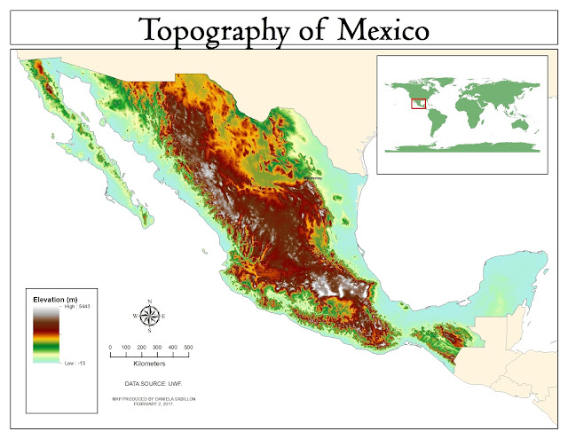
The first one (and my favorite) is a topography map. This map uses "Digital Elevation Model" (DEM), which is a type of raster data that displays elevation data. The Symbology I decided to use for this map is a pre-set Color Ramp called "Elevation #1". This color ramp is very beautiful, stunning, and natural, giving the map a feel of realism.
This second map displays multiple linear features in Central Mexico, as well as urban areas with populations of over 1 million people. This type of map is a great example (and practice) for learning to use Symbology, Categories, and Typography when displaying multiple features of the same type (linear). For this map, it was important for us to make the rivers, railroads, and highways visible, while still being able to distinguish them.
Our last display is a choropleth map of Mexico. The goal of a choropleth map is to classify or categorize data with similar values, and assign them a color within a pre-established area (in this case, they are the States of Mexico by Population). Choropleth maps are effective, easy to ready, and provide quick data visualization for making analysis and decisions.


Comments
Post a Comment