Lab 6 - Choropleth Mapping
The most widely used thematic mapping technique is also one of the most incorrectly used methods: the Choropleth. Meant to be used to depict normalized data (that is, data that has been derived through some kind of computation from raw values), choropleth maps are sometimes mistakenly used to depict total counts (also known as raw data). Instead, to map total counts, it is best to use proportional symbol mapping (which is covered in my previous blog post).
So why is it important to normalize data? What purpose does it serve? Normalizing data takes into account the different sizes of areal features (polygons) associated with those raw data values. Simply put, it makes things fair. For our lab assignment, we conducted two exercises in which we explored different ways to design choropleth maps by appropriately preparing quantitative data.
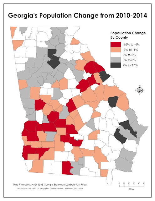
The map below examines changes in total population for the State of Georgia from 2010 to 2014. Because this change calculated both positive and negative values, using a diverging color ramp, along with an odd number of classes (five), were most appropriate in visualizing the divergent changes in population. Additionally, I used a Natural Breaks (Jenks) classification because this method best depicted the relationship in range of values, as opposed to total county counts per class.
The map below depicts my final mapping product for another exercise in which we compared three data classification methods. After analyzing the histogram, the attribute table, and the numerical summary (as furnished in my map), I determined that for this particular variable and study area, using the Natural Breaks (Jenks) classification worked best. My reasoning is as follows: on page 179 in our textbook, the authors state
that “the quantile classification is best used when range of values for each
class is approximately the same” (Kimerling et al., 2016). On page 180, the
authors state that the equal interval classification is best used for data
values that are equally distributed, which is why if it were the case, a
choropleth map depicting such information “made with quantiles and equal
intervals should look identical” (Kimerling et al., 2016). As you can see in my
final map product, that is not the case. Just because quantile had equal counts
of counties for most classes, it doesn’t mean the range in values were, too.
The equal interval classification justifies what the quantile classification
hides: an unevenly distributed range in values. By scratching out both of those
options, Natural Breaks wins. The breaks between the groupings are fairer since
it considers the relationship in range in values as opposed to counts per
class.


Comments
Post a Comment