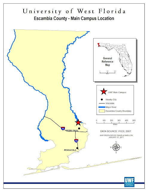
Week 2 - "Own Your Map"
Applying UWF's GIS Online Essential Map Elements (which consist of always including a title, scale, legend, north arrow, border, date, data source, and cartographer name), along with branding your map design with an authentic, creative touch - makes for a proper and successful map production.
This week I owned my map by choosing and wanting to apply cartographic design principles that assimilate (what I believe to be) professional, diplomatic "looking" maps. Anything I create is a representation of me, and
I like to be perceived as a reliable, organized, and diligent individual. This
is why I like to have the smaller map elements such as the inset map, legend,
north arrow, and scale bar aligned in an orderly and symmetrical display.
Additionally, I think that concise, prominent, and unambiguous titles project a
statement of assurance to readers since it is one of the first things they see.
It’s important to make good, first impressions, because your audience will believe
what you portray (credibility). Finally, I always try to add some type of creative graphic
design to make my maps stand out a little bit more than others. I make sure
that whatever creative touch I put on never takes away from the information the
map is trying to convey, but instead that it compliments the personality of the
map, the cartographer, and also that it “fits in” with the era we live in.
Sometimes it’s hard to focus on things that look old-fashioned and boring. And
so this is why I added the dark blue, thin, rectangular box at the footer of my
map.
During this week's lesson, we learned the importance of considering major key points before beginning to design a map. The ones I have personally found to be important in my professional life as a GIS practioner include: 1. page size and orientation, 2. elements and/or data layers needed to effectively convey the purpose of the map, and 3. audience (whom will be using, seeing, or studying this map?). All of these key points are essential because it will save time for everyone in the future, should there be any revisions (which most likely there will be). For example, I might create an 8.5 x 11 page-sized map with centerlines the width of 0.40, city labels with a font size of 8, etc. for an important stakeholder. Then, I come to find out that this map is wanted to be printed on a 34 x 60 page size – in this scenario, I would have to make multiple adjustments: thicker centerlines, larger font-sized labels (including titles and legends), as well as resizing the scale bar, north arrow, and much more. It’s best to get all the information upfront, and/or at least plan ahead as much as possible before you invest a lot of time designing a map with multiple variables.
During this week's lesson, we learned the importance of considering major key points before beginning to design a map. The ones I have personally found to be important in my professional life as a GIS practioner include: 1. page size and orientation, 2. elements and/or data layers needed to effectively convey the purpose of the map, and 3. audience (whom will be using, seeing, or studying this map?). All of these key points are essential because it will save time for everyone in the future, should there be any revisions (which most likely there will be). For example, I might create an 8.5 x 11 page-sized map with centerlines the width of 0.40, city labels with a font size of 8, etc. for an important stakeholder. Then, I come to find out that this map is wanted to be printed on a 34 x 60 page size – in this scenario, I would have to make multiple adjustments: thicker centerlines, larger font-sized labels (including titles and legends), as well as resizing the scale bar, north arrow, and much more. It’s best to get all the information upfront, and/or at least plan ahead as much as possible before you invest a lot of time designing a map with multiple variables.
And lastly, I wanted to mention that this was my first time really dissecting metadata. I never knew it could be so detailed, long, and sometimes a little confusing; specifically when looking for most recently updated date and the entity whom updated it. I wasn't very speedy at this task, but I am confident that as the weeks progress I will become more familiar with it and be able to identify these important aspects of it more quickly.


Comments
Post a Comment